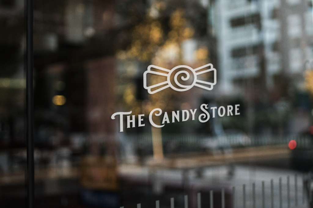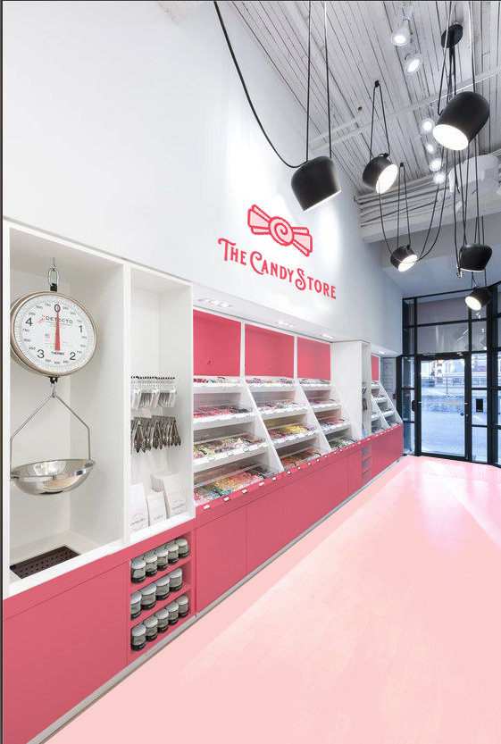
Challenge: The Candy Store, located in Sudbury, Ontario attracts young adults but has potential to increase revenue by targeting a new market: adults ranging from 25-35 years of age. The main challenge was to create a logo that is “retro” (encapsulates the vintage candy store feeling) yet still modern and appeals to the new target market, while still remaining relevant to young adults. One of the bigger challenges was to recreate and design an interior location that remains true to the new updated look and modern ideals.
Here was my solution.
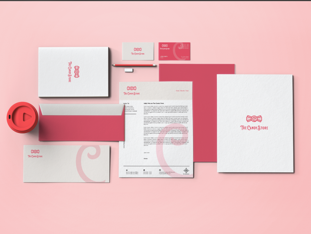
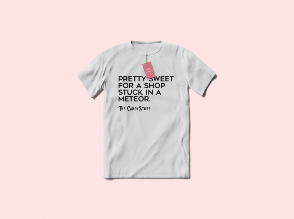
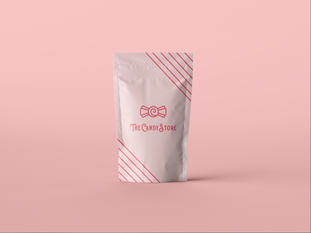
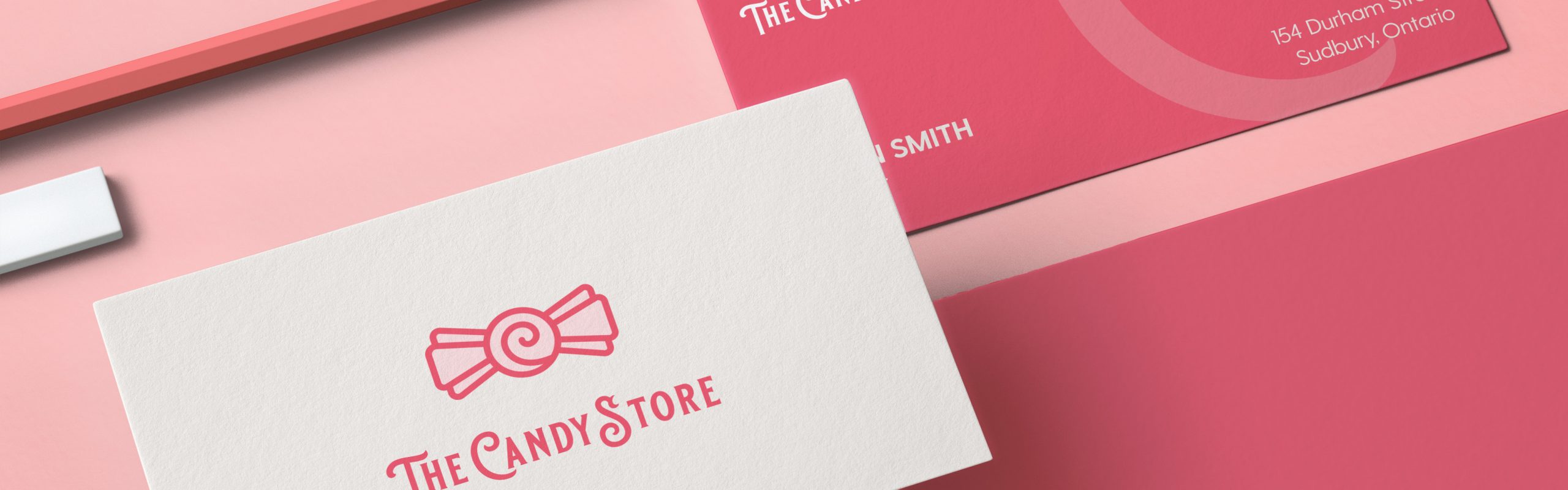
I created a dynamic, retro yet modern logo by being influenced by the Art Deco era. The new logo is fresh, clean, yet still eye-catching and maintains the new values of The Candy Store. The new logo is simple enough that it is adaptable to many different mediums and can be worn even as merchandise. It is traditional yet modern enough that both targets will resonate with its identity. I wanted the website to be equally fresh, as well as a little more modern to maintain relevance. The interior space is modern and fresh, while the outdoor location holds true to traditional ‘brick-and-mortar values.